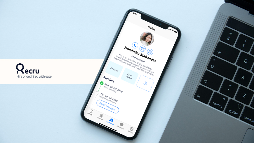
Recru - A recruitment app for iOS.
A hassle-free way to get access to a pool of talent and make your workflow faster.
Problem Statement
Recruiters typically manage a large number of job openings (job requisitions) per day, each with several candidates ranging from a few to a few hundred. These candidates must go through stages; be reviewed, screened, interviewed, etc. This process is coordinated with the Hiring Manager
To ensure that they are making progress on all their job requisitions, each day recruiters must decide what requisitions need their attention and action, and each recruiter determines this differently. This can range from number of new candidates, how close the job is to being offered, how many days the job has been open, or low number of applicants, to name a few.
Research Insights
- 1. Deal with large number of data in the interface – 100s
- 2. Allow users to manage the candidate’s journey
- 3. Make it clear for the user their priorities – allow them to control priorities, ability to allocate resources to specific cases
- 4. Had done some research on other competitors in the market like Lever, Greenhouse and Smart Recruiters
Research
User research focuses on understanding user behaviors, needs, and motivations through observation techniques, task analysis, and other feedback methodologies. For me user research is “the process of understanding the impact of design on an audience”.
User needs
System needs
Personas
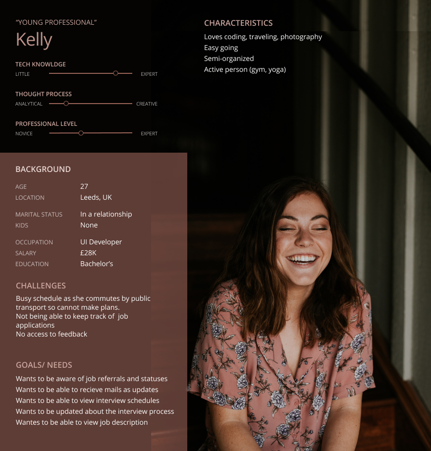
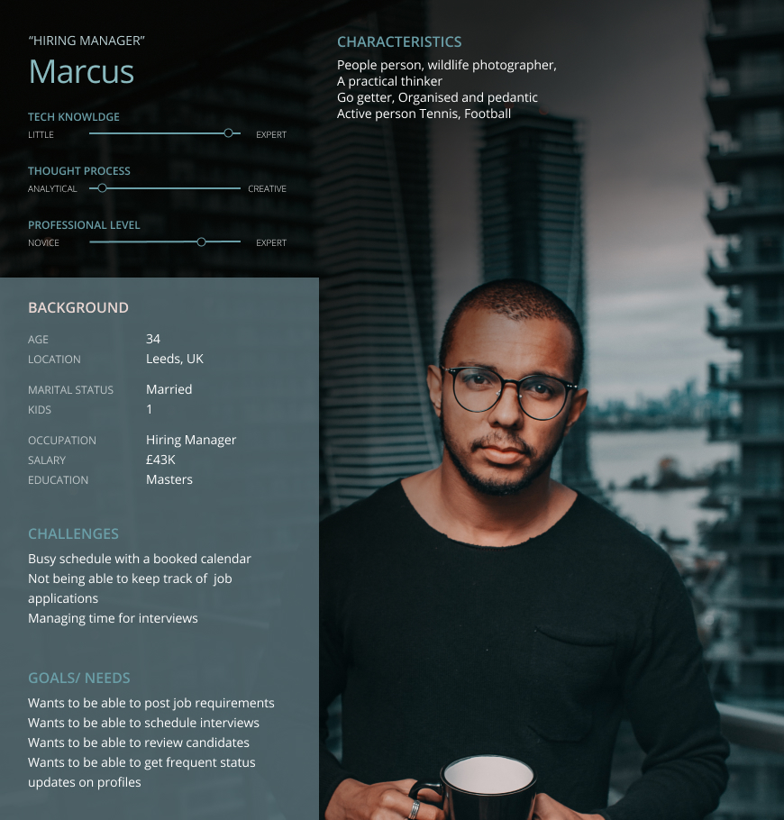
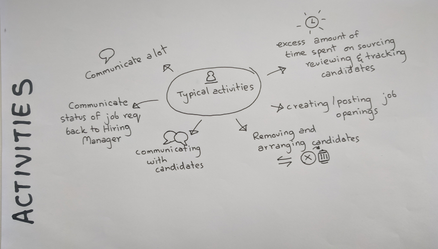
With common scenario’s in place, we were able to define detailed personas, using their vast data pool. I came up with personas to show a hiring manager as well as a young professional. This further helped recognise that different people have different needs and expectations, and it can also you to identify tasks. This helped break down tasks and make it less complex as a guide to the ideation processes. The personas looked something like this:
Storyboarding
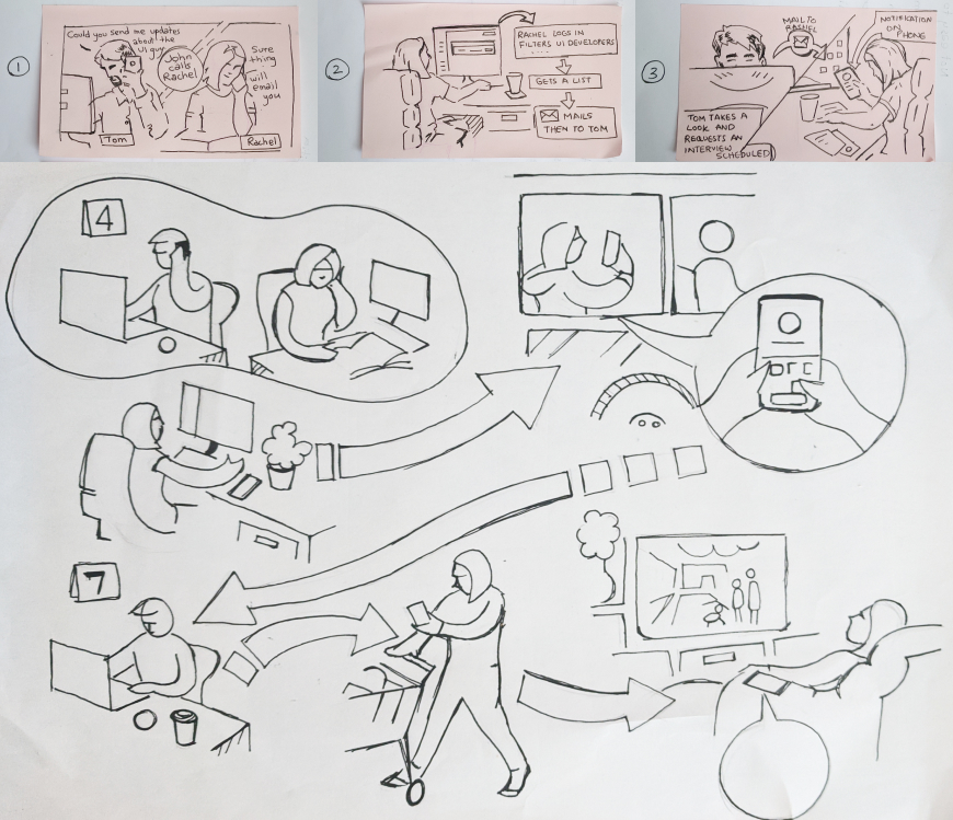
To get a better understanding of the tasks at hand I had created some simple storyboards to show the chain of events I had in mind. These reference drawings later helped develop assets for the onboarding screens for the app.
Wireframing
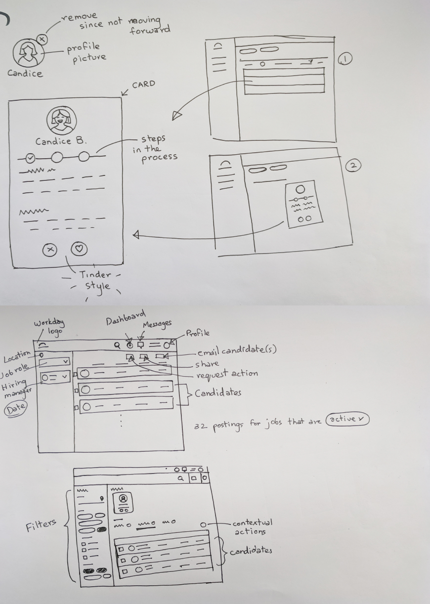
With proper planning, we were able to confidently move into creating wireframes for the app. We took the decision to focus more on the functionality and structure of the app, opting for low-fidelity wireframes with very little detail. Ultimately, we could add design elements in later, what was important for our users, was that the product (above all) was clear and simple.
User Journey Map
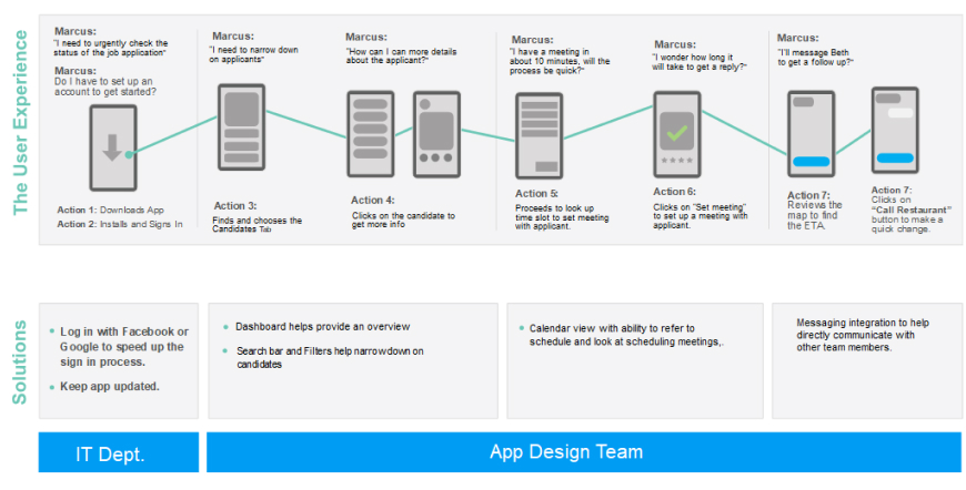
Based on a defined user flow I created a prototype in Figma.
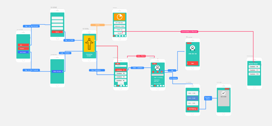
Task flow
The task flow gives an idea of a single interaction of a user logging in and then exploring the app going about selecting a candidate and either calling him/her or setting up a meeting with the candidate.
Design
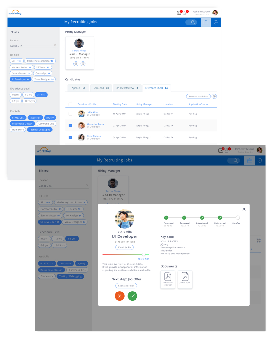
As decided on raw paper wireframes we wanted to have a filter to search through candidates quickly, and also reply back to them or send messages or emails to other team members in the process.
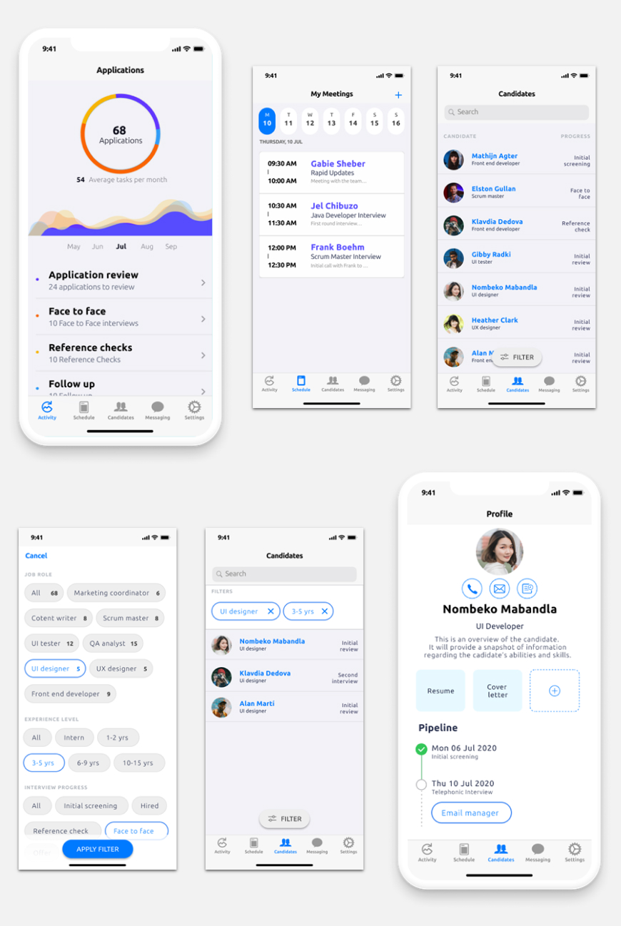
Mobile UI Design
Although designed with the intent to be used as an iOS app, the mobile designs had to be in line with the look and functionality of the desktop app.
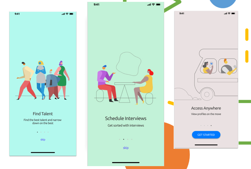
Extras - On boarding screens
Although not asked for I felt this could add some value to users finding their way through the app the first time. This of course needs to be validated as to whether onboarding screens are required by users.
Retrospect
To check if the new design works or not, additional usability tests should take place.
Finally, the feedback from the experts and users was positive and main advices on continuing exploring the interaction using different visual cues as well as exploring the interactivity of the system. The comfort and usability were highly improved on the final design. The visual cueing system proved to be effective under several circumstances.
