Green Vibe
Figure 1. Screens from the Green Vibe app.

Green Vibe - A gamified web app

A web app, focusing on building social and environmental awareness with a good user experience. By using this app, potential users can effectively learn the importance of a maintaining a low carbon footprint whilst enjoying the experience.

Problem Statement

How might we motivate people to be environmentally conscious in an effective and fun way?

There are a lot of apps out there that help people be more socially conscious but not really serving a purpose. People are not motivated enough to a task.

My role Duration Tools
  • Sole UX designer
  • Sole Visual designer
  • Sole Interaction designer
  • Front end developer

8 weeks

  • Paper and pencil
  • Figma
  • Flowmapp
  • Github
  • VS Code

The Context

Why Who When and Where What

This app has a focus on the environmental concerns realised by AO and an innovative way to bring about change.

The web app would target music lovers, environment enthusiasts, and gen y who have a desire to work with fun.

People would use the web app to log in recycled items on the go

The web app would be user friendly as well as responsive in nature containing a database of users and other metrics to track statistics.

Figure 2. The design process we went through.

Research & Analysis

User research focuses on understanding user behaviors, needs, and motivations through observation techniques, task analysis, and other feedback methodologies. For me user research is “the process of understanding the impact of design on an audience”.

User scenarios

I needed to think of approaching the web app with the limited data available. I needed to define the user base, the way these users behaved and possible use cases for the app.
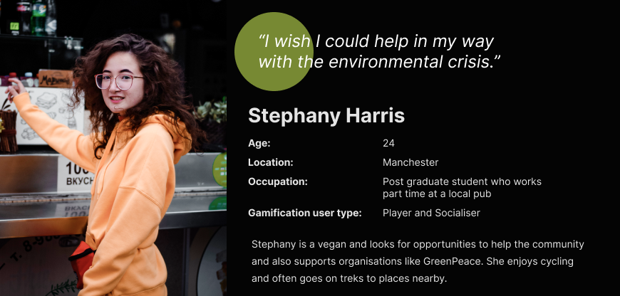
Spontaneous Planned

Spontaneous action, in places where there is a need to recycle, such as shopping malls and entertainment centers, cafes and restaurants. Initially, the aim is not planned or intentional.


Desire comes from unexpected places, such as seen by poster at the bus stop, random places with attributes of Environmental concern, on social media, or conversations with friends.

Often implies a view of the expected action, or the familiarity with the action associated. In this scenario, the user is planning to take an action on recycling content.


Desire to appear after exposure to promotional material, the expected viewing of advertisement, blog on social media, the recommendation of friends.

Personas

With common scenario’s in place, we were able to define detailed personas, using their vast data pool. The personas looked something like this:

Figure 3. Stephany's persona.
Persona #1 Persona #2
Name & Job Stephany, Student working at a local Steve, Environmental Manager
Age group 18-26 y.o. 28-44 y.o.
Motivation and benefits of product usage

Fun and modern way to recycle waste. Discounts on tickets. Save money and earn rewards.

Fast and reliable way to check tasks and updates in one place.

Need and context of use

A frequent visitor to gigs in the city, a music lover. As the need demands to dispose off unwanted stuff.

A quick way to select tasks, navigate to sessions, and check priorities.

Way to product

Recommended by friends, social media and Promotions.

Recommended by company.

Digital literacy

High

Middle

Green Vibe’s personas.
Generating ideas

We had come up with some concepts that we brainstormed as a team
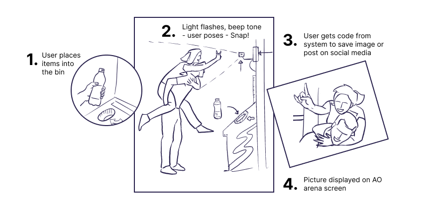
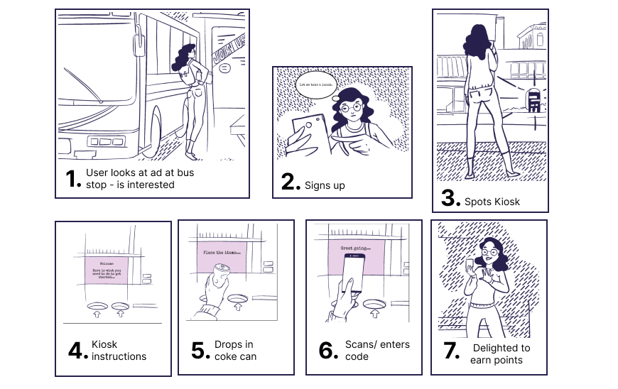
Concept 1 Concept 2 Concept 3
Scan feature on Mobile

The second idea was camera based, where the user could take pictures of waste items like bottles and kind of verify that 20 have been recycled for 200 points for instance and watch her/his points grow.


With an added use case of taking pictures of travel passes from public transport to get green points.

Kiosk

The idea revolved around the fact that a music fan visits the AO Arena and within the arena there are kiosks set up to collect recyclable waste. The user would use the web app to enter a code or scan a QR code generated to add points.


The user then checks her/his “green points” and when they have reached a certain level - they can be redeemed(get discounts on tickets, music shops and the canteen inside the venue).

Camera aided interaction

The concept involved having a camera embedded in the kiosk. When users would throw in recycled items into the kiosk, they would hear a beep and see instructions on the kiosk screen to pose for a picture.


Once the picture was taken it could be downloaded to the app via NFC or scanning a code for social media. As a bonus users have their picture displayed on the AO arena screens.

Three concepts for Green Vibe.
camera concept
Figure 4. Camera concept.
Storyboarding

With a storyboard in place we could chalk out some user flows as well as task flows.

storyboard
Figure 5. Storyboard.

Wireframing & Prototyping

With proper planning, we were able to confidently move into creating wireframes for the app. We took the decision to focus more on the functionality and structure of the app, opting for low-fidelity wireframes with very little detail. Ultimately, we could add design elements in later, what was important for our users, was that the product (above all) was clear and simple.
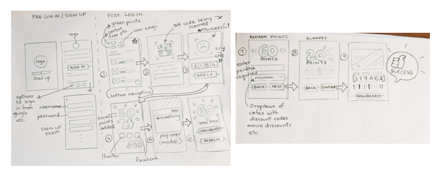
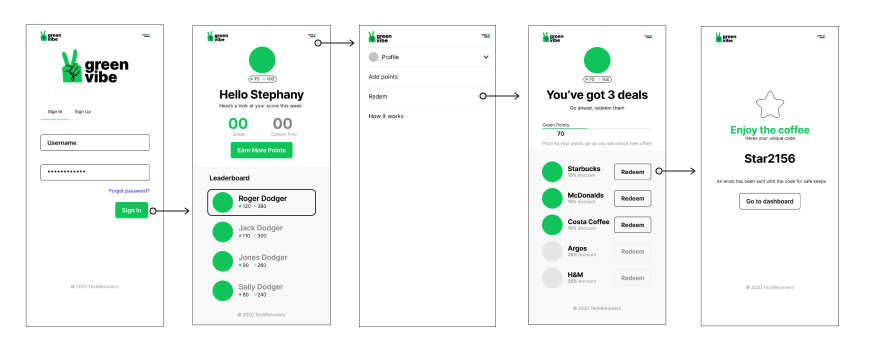
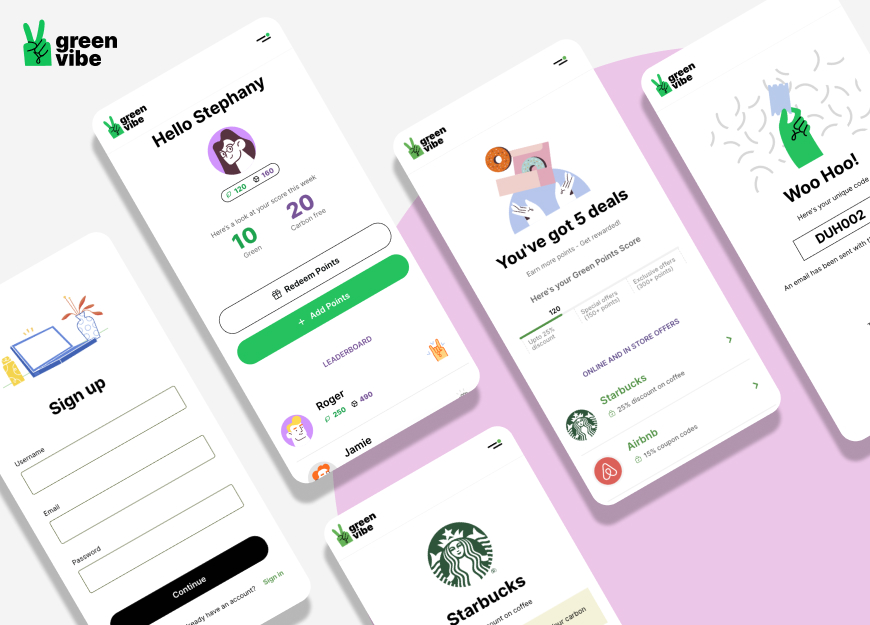
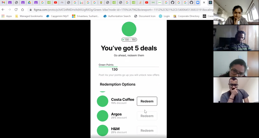
paper wireframes
Figure 6. Green Vibe’s paper wireframes.
mid fidelity wireframes
Figure 7. Green Vibe’s mid-fidelity wireframes.
Prototyping

Based on a defined user flow I created a prototype in Figma.

User testing

User testing is a technique used in user-centered interaction design to evaluate a product by testing it on users. This can be seen as an irreplaceable usability practice, since it gives direct input on how real users use the system. So I decided to use this technique in the web app with these tasks:

  1. Log in or Sign up;
  2. Add points;
  3. Redeem points;
zoom test
Figure 8. I had to facilitate and conduct user testing over zoom calls.
User testing results (before & after redesign).

Design

One major change in the app, was to focus on the user entering the code manually to add points.Tis was solely due to the reason of shifting the focus from a higher MVP to a lower MVP due to the short timeline of the overall project.

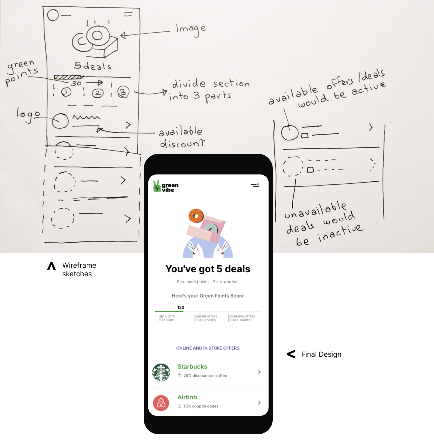
We also needed to create a simpler, easier and more structured way to showcase points available to be redeemed by users. By keeping an overall score and dividing the score by 3 we could categorise offers into sections where users need to level up in order to get better deals. Within the app, we created a simple and clear hierarchy users could learn and follow.

points bar
Figure 9. Green Vibe’s Redeem offers screen.

Visual Design and Animation

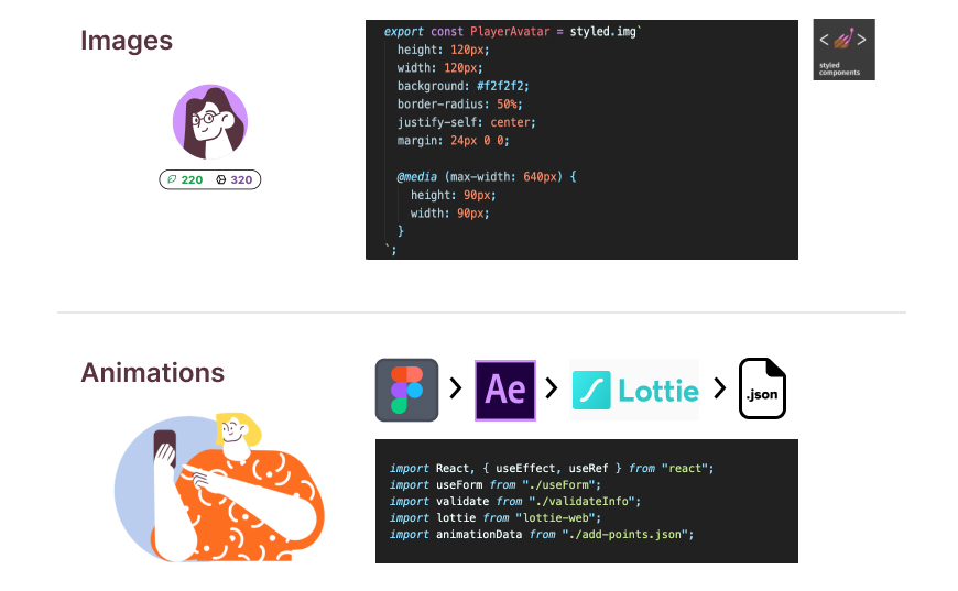
Modern designs support a lot of graphics and animations to aid interaction design. I had created the illustrations in Figma and then had them exported to Adobe After Effects where I animated them. These animations were then exported to Lottie where I downloaded the json files to be added to my React code. Take a look at a sample animation and code.

interaction design
Figure 10. Visual Design, Interaction design and React Code.

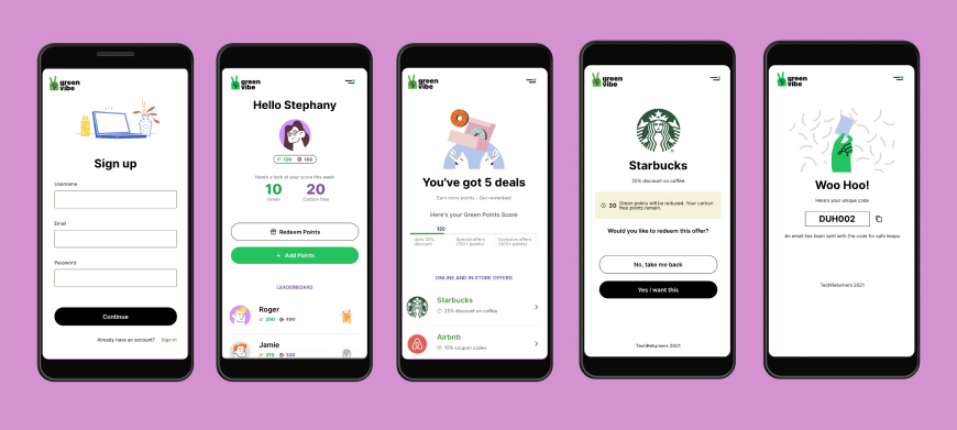
High Fidelity Designs

After running the tests and getting feedback I moved on to the final design.

interaction design
Figure 11. Final Designs.

Retrospect

UI testing gave us an idea of how to properly organize the structure of the application, providing the most positive user experience for Green Vibe's users.

  1. To check if the new design works or not, additional usability tests should take place.
  2. Something that can be improved and worked on is the way the user adds points by scanning the code. Furthermore maybe a kiosk locator or map within the AO arena.
Date February, 2021
Type Web application, Prototyping design
Share